BRIEF
Take a brand new, kick-ass, fully customizable gaming platform with high-end components and a develop a brand identity, voice, tone, look and feel. Their product contains top of the line hardware that can be designed to fit a customer’s skill level, gaming preference and visual aesthetic. The result is a personalized package that’s put together for players to go OP and dominate in their own way.
ROLE
Creative Director / Art
Writer
Oversaw a team of three designers to develop the brand identity, look & feel and tone of voice.
RESULTS
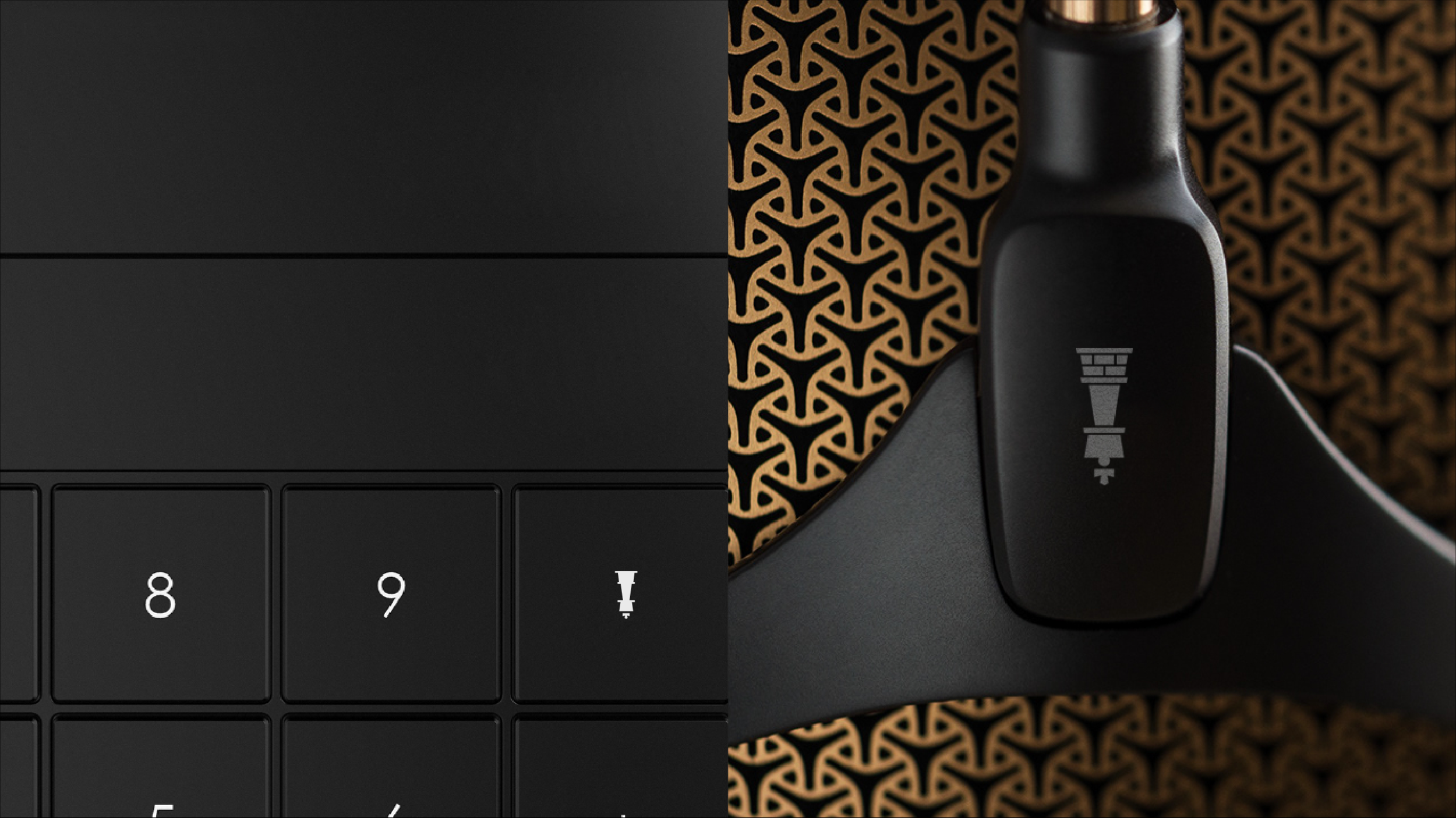
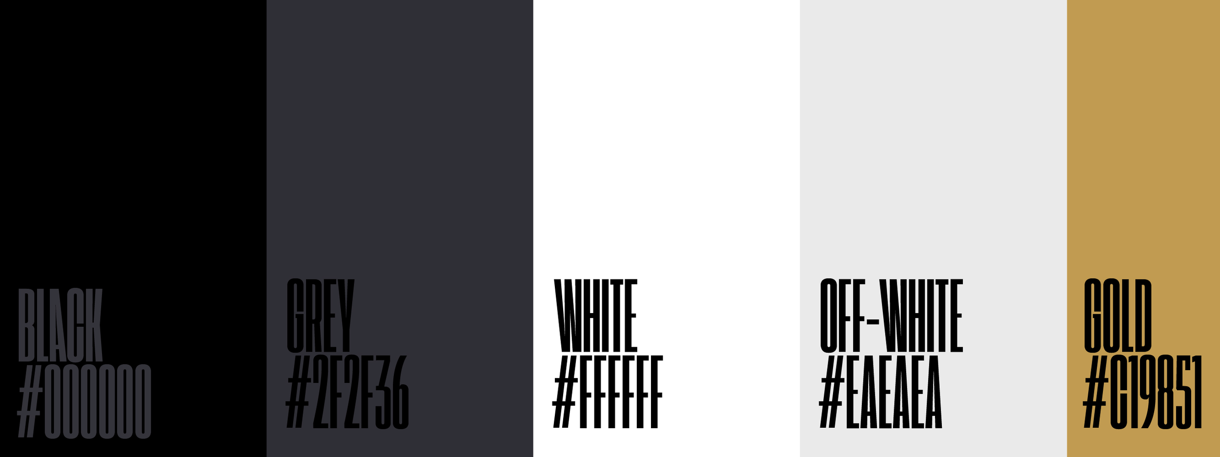
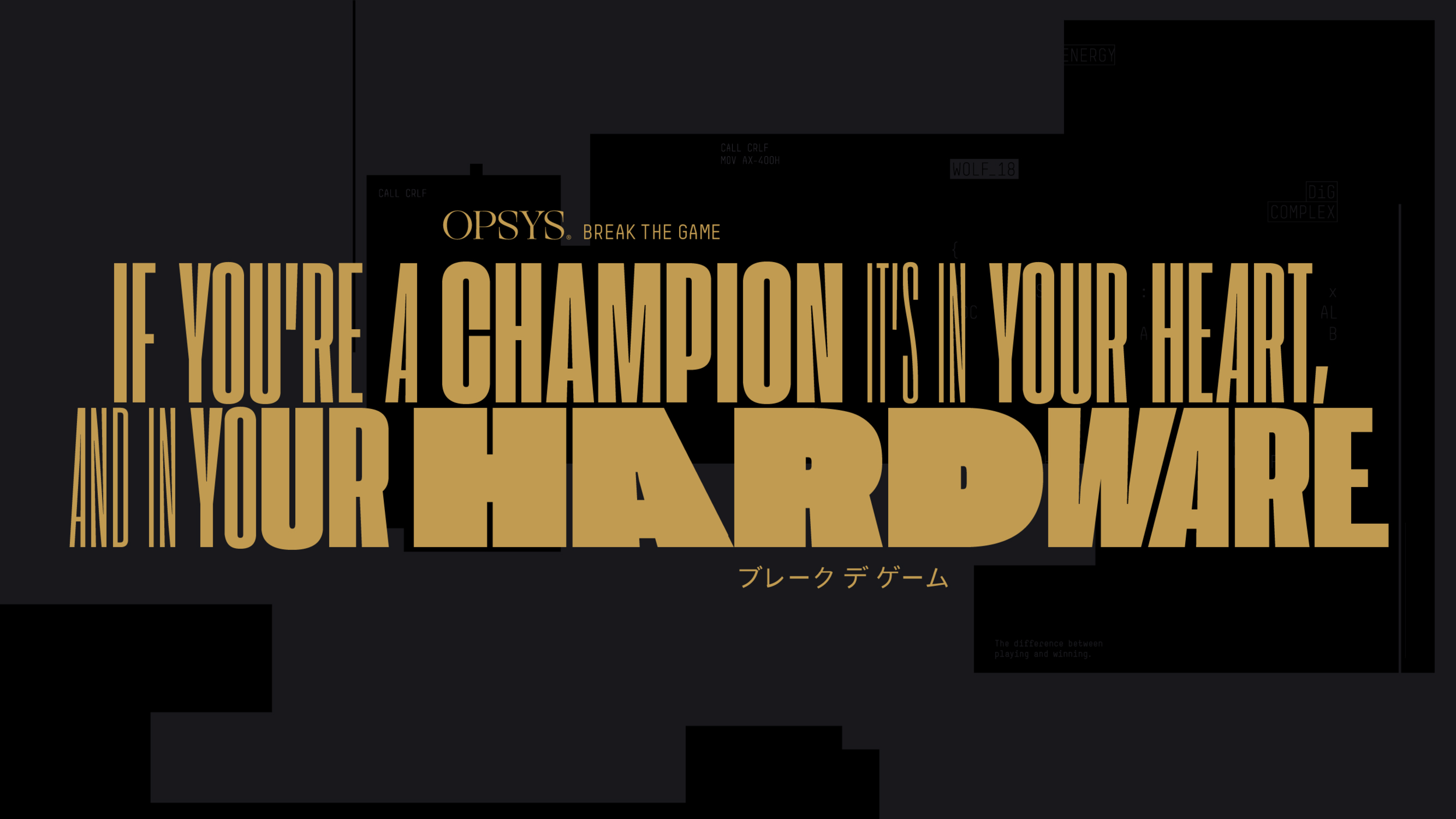
Recognizing that all gaming platforms had brand identities with black and bright primary colors, we took a different path for the winning, kick-ass fully customizable platform that can overpower other players, and made gold our accent color. Not only did we push OPSYS domination through the use of gold, but also through the use of attitude, in tone of voice, typography and photography.
disciplines
+ Brand Strategy
+ Brand Messaging
+ Brand Identity
+ Print Design
+ Photography
+ Visual Design
